Mockups Credit:
Adobe Dimension was used to create the mockups
123rf.com (mannequins)
Roman Holoschchuk and Jackie Parker on Upsplash (images on website mockup)

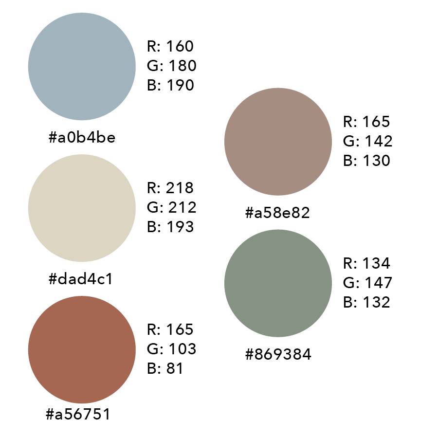
Color Palette

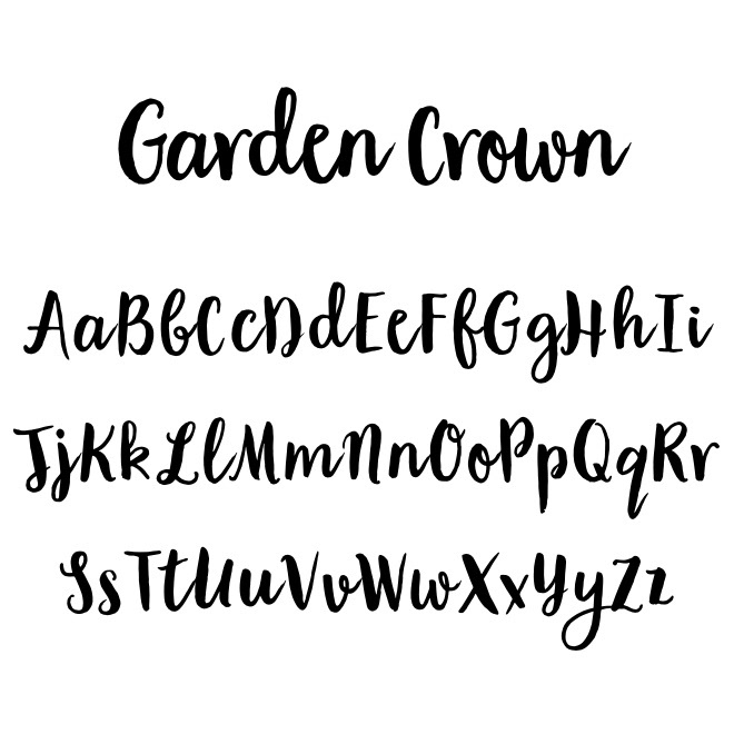
Garden Crown
When starting a project I like to start with creating a mood board. This allows me to fully grasp what a brand is about and the tone that they want to put out into the world. Here you can see that for the sub-brand I wanted to bring in neutral colors for a warmer, more inviting feeling.
Having this mood board allowed for me to think of picking a typeface that was more organic. After picking a more handwritten font, I treated the letterforms with a paint brush texture to make it come across as even more natural.
Procreate and Adobe Illustrator were the main programs used for this project.

